SurfaceShare
UX RESEARCH | UX DESIGN | UI DESIGN
This case study outlines the design process for an app and the creation of a unified design system. The creation of design system simplifyed both design and development process. The goal was to create a clean, modern interface, and I also identified and addressed several gaps in the previously designed user flows.
Role
UX Designer
Year
Apr 2023 - On going
Tools
Figma, FigJam,
Google Meet, Confluence
Introduction ๐Ÿ‘‹
SurfaceShare is a platform where businesses or individuals can search for and secure advertising opportunities on other businesses' platforms. Users seeking ad space can browse available options, which might include locations such as storefronts, digital screens, packaging, or even product placements. The app allows users to filter listings based on factors like industry, location, or audience, facilitating direct inquiries or bookings with the business offering the space. Additionally, the app streamlines communication, pricing, and agreements, simplifying the process of placing ads in strategic business locations.
Problem โ—
Businesses and individuals seeking to advertise often face challenges in finding and securing suitable advertising spaces that align with their target audience, location, and budget. Traditional advertising channels are often costly, time-consuming to negotiate, or limited in availability, especially for smaller businesses or niche advertisers. On the other hand, many businesses have untapped advertising space on their physical or digital assets that could generate additional revenue but lack an efficient way to connect with potential advertisers.
Goal ๐ŸŽฏ
A digital platform that streamlines the discovery, booking, and management of advertising opportunities across various business spaces (Surfaces), making it easier, more affordable, and clearer for both seeking advertising (Seekers) ย and those providing space (Sharers).
Research ๐Ÿ”
In the initial stage of the project, the client provided an initial concept, key priorities, and a previously suggested user flow. My task was to improve upon these by developing enhanced user flows, wireframes, mockups, and prototypes, as well as creating a unified design system.

In an introductory meeting, we reviewed the assets provided by the client and discussed the project details with the project manager. We immediately focused on identifying the potential user groups, as the app would cater to three distinct roles: Seeker, Sharer, and Supplier.

Given the complexity of the product, it was essential to establish a thorough understanding of how these user roles interact. While reviewing the brief and discussing with the team, I identified several questions. Specifically, I needed clarity on how the roles were related and how the app should respond to each user group. The brief offered a high-level overview but lacked specifics on the services the app should provide to each role. To address this, we needed to design distinct user flows for each group and ensure that users could easily switch between roles within the app, should they wish to adopt multiple roles.
Key Takeaways:
  • How might we navigate new users through the app.
  • How might we simplify the surface booking process.
  • How might we improve the chances that each seeker find the right surface.
  • How might we provide sharer and supplier an overview of their business.
  • How might we help the seeker, sharer and supplier communicate each other without confusion.
Ideation ๐Ÿ’ก
Brainstorming
With the "How might we" statements as a foundation, I moved forward with brainstorming potential solutions to address the identified issues. Building on insights from the research synthesis, I started sketching ideas and conceptualizing strategies to solve users' problems.
User Stories
For the client's initial prototype, the most critical user stories focused on the core functionalities of the application. These stories were vital for demonstrating the project's feasibility and I arrived at these points through discussions with the client and project manager.
  • As a new user, I want to be able to sign in, create an account or skip.
  • As a seeker, I want to be able to find and book surfaces in my nearby locations.
  • As a seeker, I want to check the status of my bookings.
  • As a sharer, I want to be able to create surfaces and manage them.
  • As a supplier, I want to be able to create supply items and manage them.
User Flow
Refering the rapid sketches, I created user flows tailored to each user type, which were then presented and refined in group work sessions. These flows were identified as crucial to the application, as the app needs to function differently depending on the user type. Through work sessions, we went through several iterations, incorporating client feedback to refine the experience, ultimately ensuring users can easily perform tasks such as booking and managing a Surface.
Design ๐Ÿ–ผ๏ธ
Wireframes
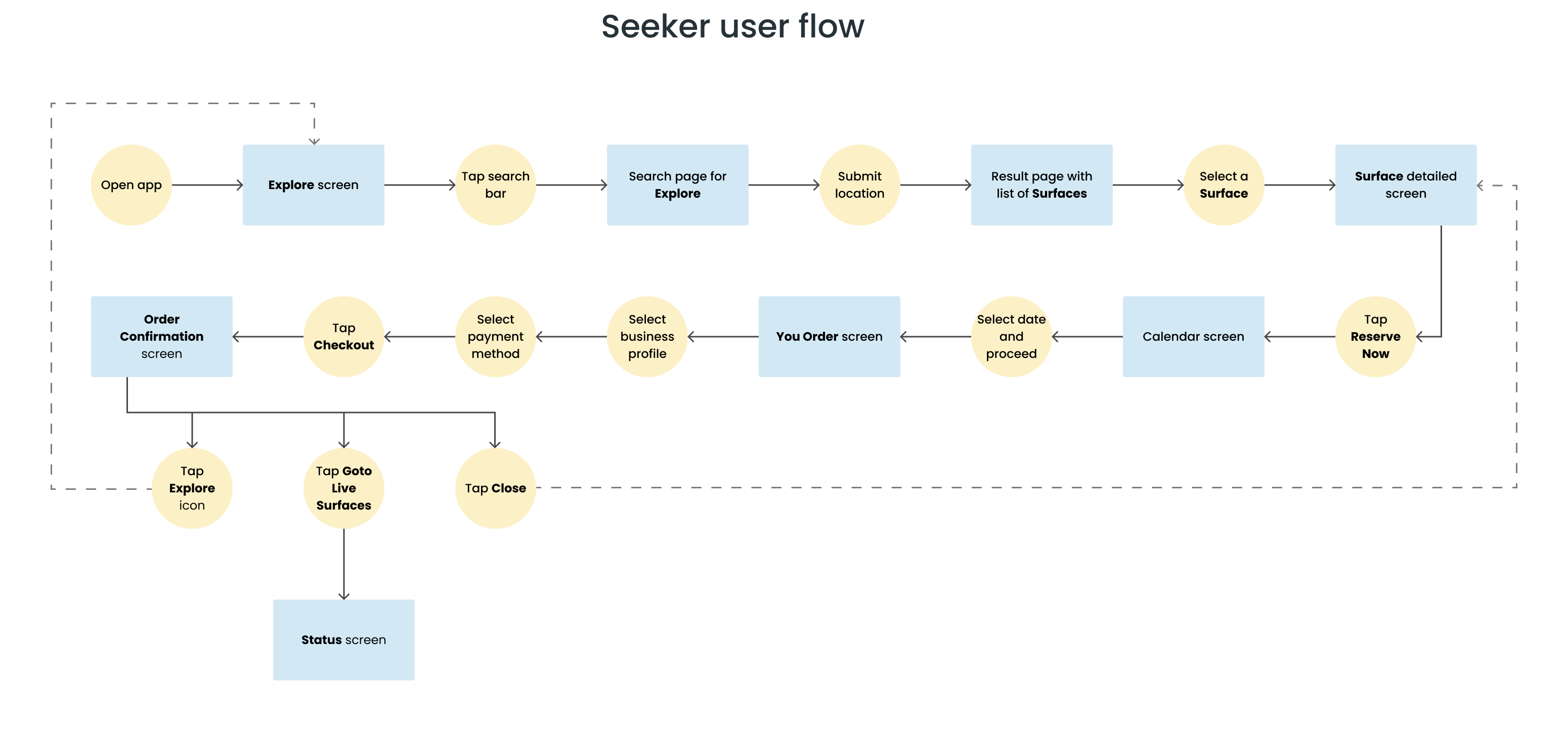
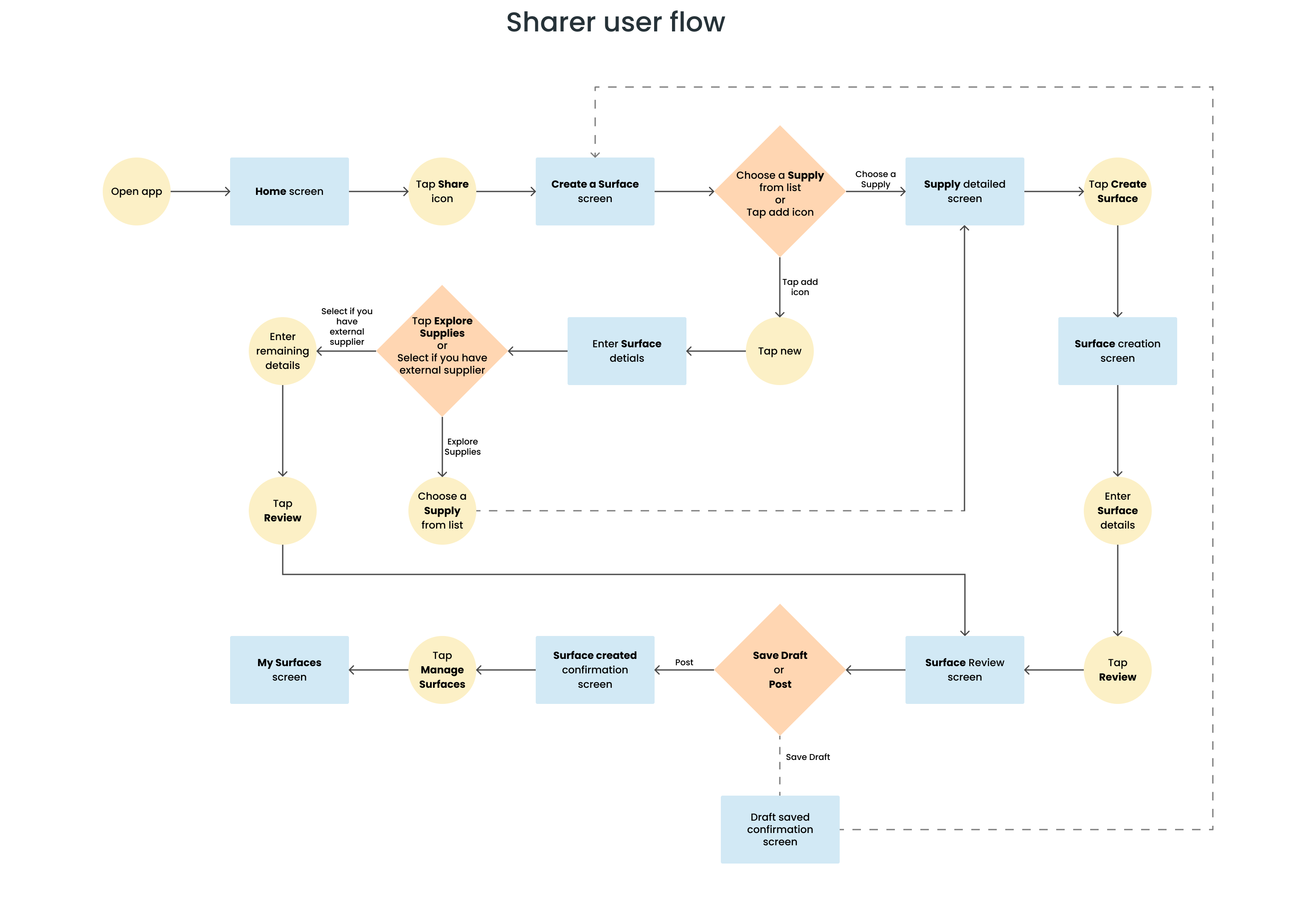
In the initial wireframing phase, I created multiple design iterations for each user flow, with a focus on the primary features: Surface booking for Seekers, Surface creation and management for Sharers, and Supply creation and management for Suppliers. These iterations allowed me to refine how key information and features were presented. On certain screens, I gave extra attention to content organization to ensure it was clear and easy for users to understand.
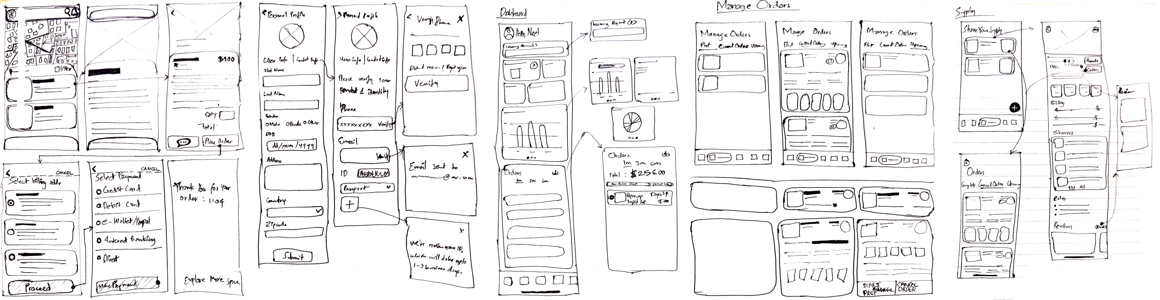
After finalizing the wireframes, I collaborated with the client and project manager in a session to create low-fidelity prototypes. We then brainstormed about color schemes, typography, and reviewed some UI inspirations the client wanted to incorporate into the app. I assessed these ideas and suggested alternatives for a few of his choices, which he was happy to accept.
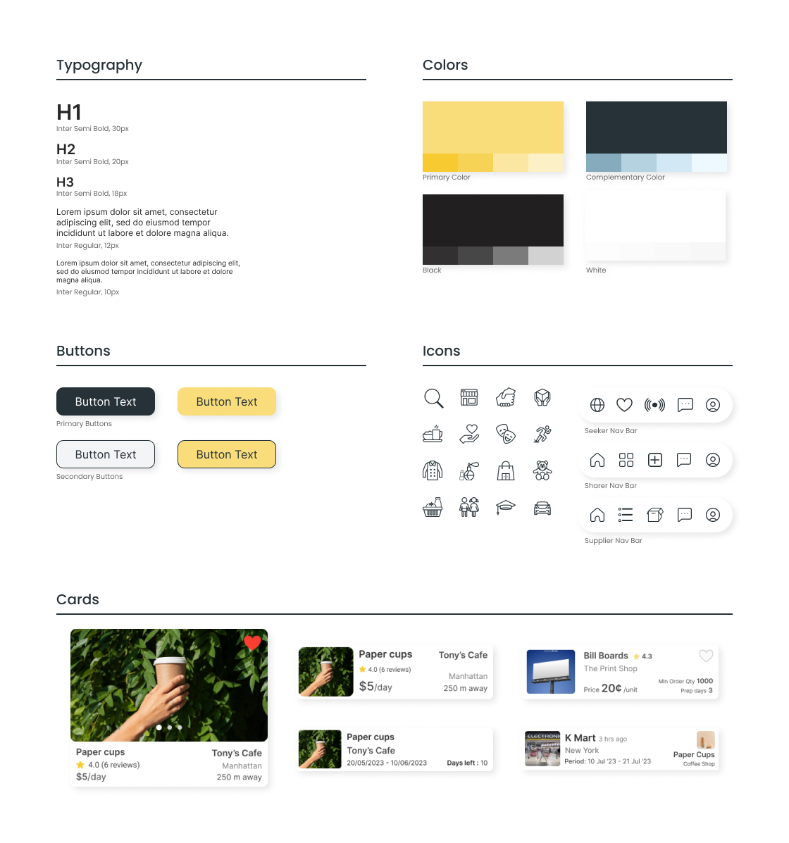
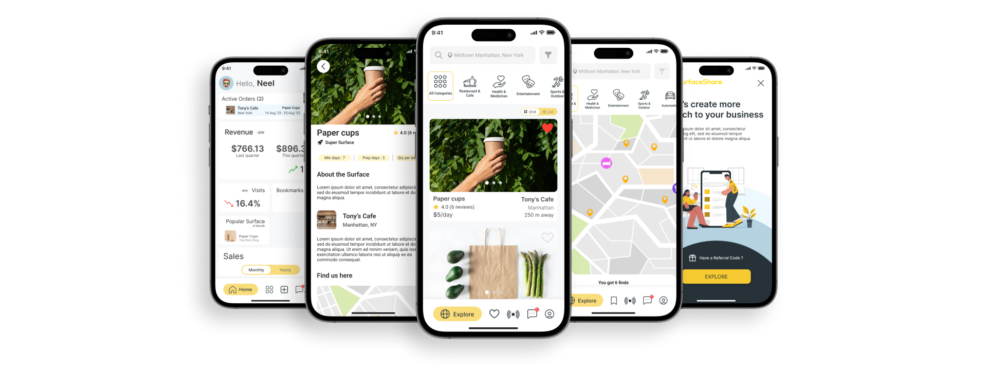
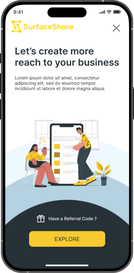
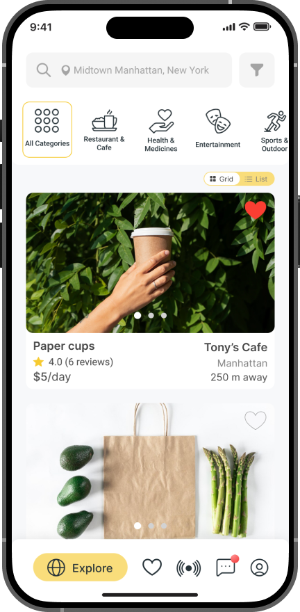
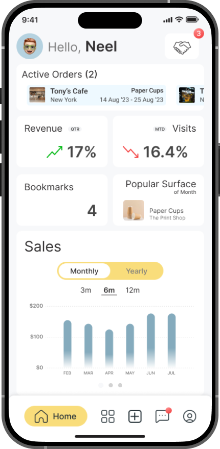
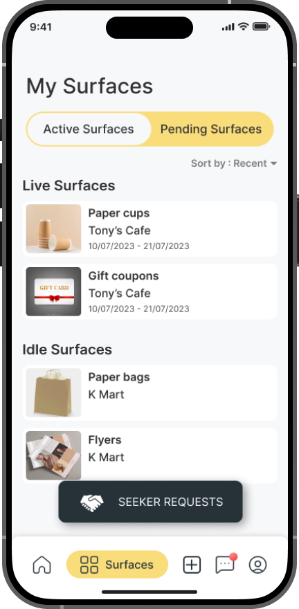
Final Design
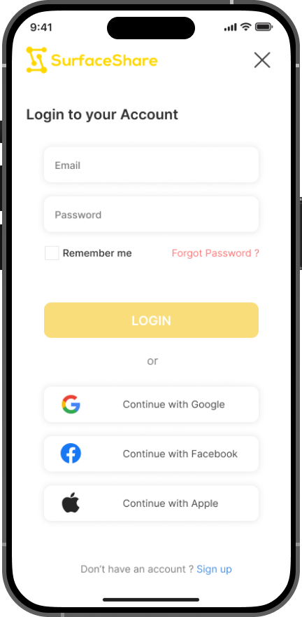
Using Figma, I developed high-fidelity prototypes for each key user flow. Through multiple iterations, I refined the design, enhancing elements that worked well and improving those that lacked clarity or hindered the appโ€™s usability.